

Design systems: best thing since sliced bread apple pie
"If you want to make an apple pie from scratch, you must first create the universe.”
- Carl Sagan
YEAR
2020
DURATION
9 months
ROLE
User Experience Manager, Design Lead
Background
At press time, StackPath had 7 portals as a byproduct of 6+ acquisitions over the past 4 years.
As the company makes the move to define agile practices and continue to lock in big name clients who shall not be named, a single source of truth is needed to consolidate all 7 portals, some of which still use legacy URLs.
BUSINESS GOALs
Begin the process of consolidating 7 portals into 1, sunsetting legacy products when needed, with a single interface and defined components to rule them all.
DESIGN GOALS + CHALLENGES
Provide a single source of truth among customer-facing applications, as well as in the internal portal.
Audit all of the portals and tag features and components that would need to be designed for MVP.
Providing an accessible and seamless experience. “Design for one, extend to many.”
Increasing efficiency across teams. Increase the speed and velocity—and decreasing the cost—through the use of reusable components.
Optimizing user experience flows, while utilizing or refining new components and reducing cognitive load.
SUCCESS METRIC
Designing components for 90% of the use cases in the current interface portal, providing a documentation site and some coded presentational components.
GUIDING PRINCIPLES
Consistency
Inclusivity and Accessibility
Functionality
Efficiency
In general, this design system is striving for consistency in interactions and expectations, as well as is intentionally designed for all abilities.

Cosmos - Documentation site
STAKEHOLDERS
Every department at StackPath, from Sales Engineering to Support, Product to Billing was actively engaged and invested.
Contextual inquiries (CIs) were conducted with members of every internal team—even Legal/Security—to ensure that the team was accounting for most components for MVP and to inform any flow enhancements that were possible.
Internal
External
Billing
Engineering
Legal/Security
Product
Sales Engineering
Customers
Enterprise
SMB
PROCESS
The first order of business was drawing inspiration from other design systems, but also drawing from architectural marvels, advertisements, isometric illustrations, music, and animations––even an Instagram account featuring mesmerizing zen rock garden formations.

Explorations One of many, many mood boards, color play, inspo and explorations divided into many pages. Apparently, Figma does have boundaries!
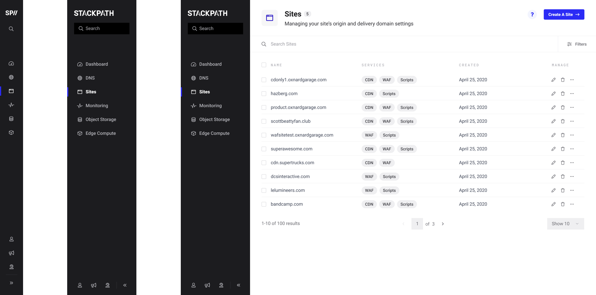
By combing the repository, designers had created a site map for the 7th portal as a list of screens for me to audit and to document the use cases that existed. The 7th portal was selected by the Chief Technology Officer at the time as the platform on which to begin integrating or sunsetting legacy products, as needed.
Next, came the design for the foundational aspects of the design system: guiding principles, typography, color, grid, layout and composition. Working with our resident Technical Writing Manager, he finessed any “rough cuts” into true tenets. As for the typography, IBM Plex Sans is a friendly, humanistic sans, notorious for its baked-in accessibility and its availability as a Google font and was hands down my first option. However, the Brand team in Marketing ultimately vetoed Plex Sans, as IBM was a direct competitor in the edge computing space.
Atoms, molecules and atoms, oh my.
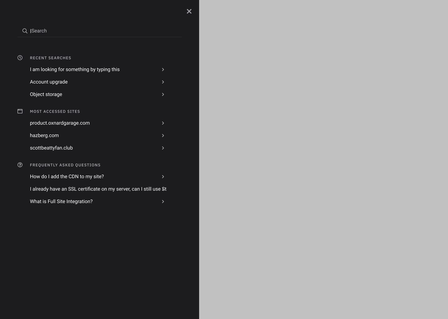
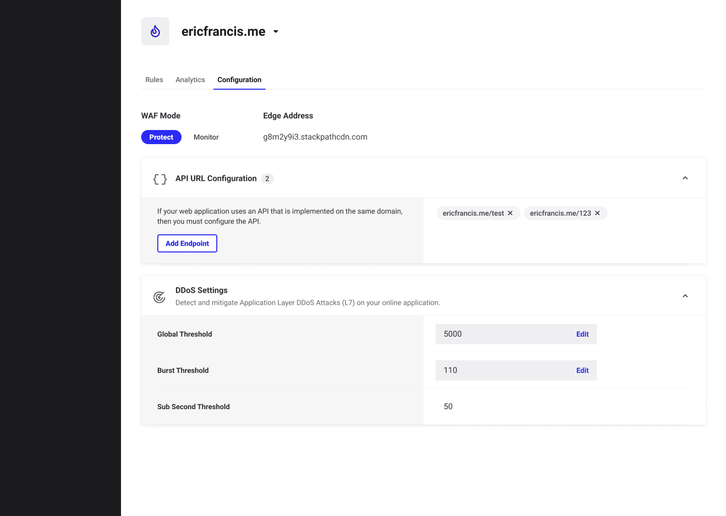
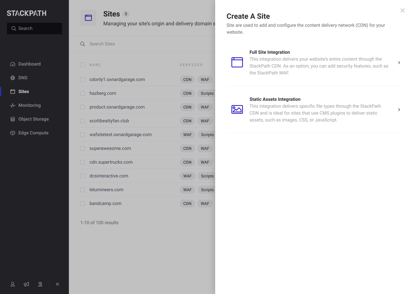
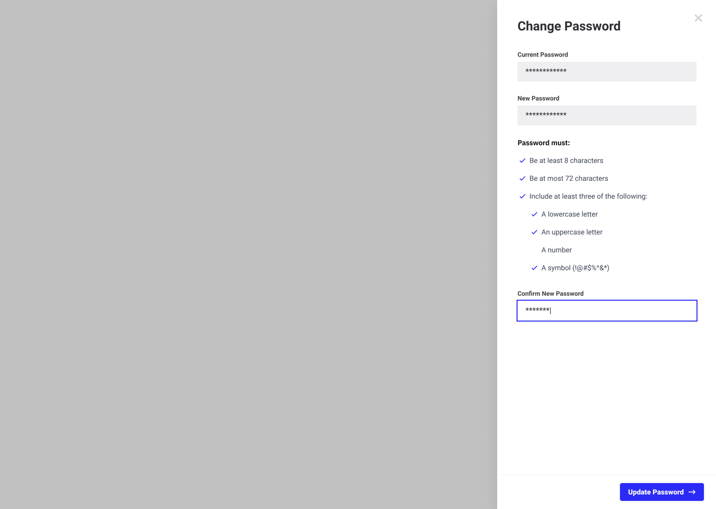
At this point, I guided the team into explorations for common flows. We began by creating variants of input fields, imagining what tables, profile pages––even password requirements, as most patterns would become repeatable and components would become reusable––could and should look like.
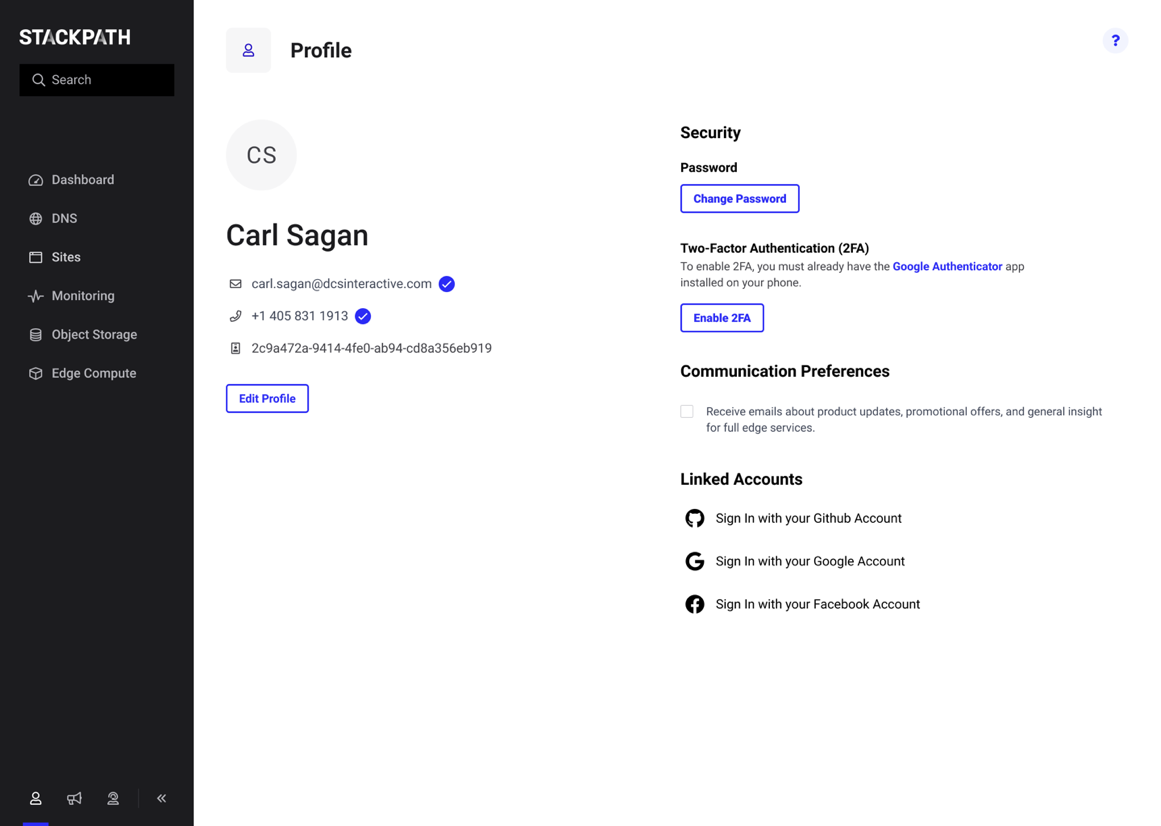
In addition to the platform, I thought it would behoove the organization to have alignment on marketing materials, the marketing website––even the humble invoice––to achieve consistency across all of the digital realms. Working together with the Engineering team, we were able to achieve the first steps of unification.

The final documentation site was intentionally simple by nature. It served a distinct purpose of informing others building products in the company on the usage of these components. Voice and Tone were also added to advise others on content usage.


OUTCOMES
The team would continue to develop presentational React components, as well as bridge the divide between design and code in Framer.
Continue to iterate on and refine components, based on validations.
Define processes for needed component redesigns or introducing new components into the design system.